

Making Sensor Data Pretty
OSCILLOGRAPH Makes Data Visualization of Sensors Easy and Beautiful

On the back end of my property, on a windowsill in the workshop, there is an Arduino. It has been sitting there for about six weeks now, attached to a stack of four cheap sensors: temperature, humidity, pressure, light. It is reading the air just outside the window, which on this side of Wills Mountain means it is mostly reading the fog that pours through the Cumberland Narrows on cool mornings. There is a particular cadence to the fog here. The temperature drops, the pressure shifts, the light flickers as the gray slides through the gap. The numbers know about it before I do.
Until recently, the only way I could see those numbers was to open up the serial monitor in the Arduino IDE and watch them tick by in three or four columns of plain text. You can do this for a while. You can stare at them for an hour and not actually see anything. The data is right there in front of you, and it is invisible.
What you want is a panel. A wall of instruments. The kind of thing that used to live behind the dispatcher’s window at the old Cumberland yard, with proper gauges and indicator lamps and a chart pen scratching out a line on a slow paper drum. Or, if you are thinking smaller and more recent, a dashboard. The data is the same. The frame is what changes.
So I built OSCILLOGRAPH. It sits in your browser and talks to your Arduino over USB (wifi and BLE coming soon). You connect, you drag a chart from the palette onto the canvas, you bind it to a channel, and that is it. You have a dashboard.
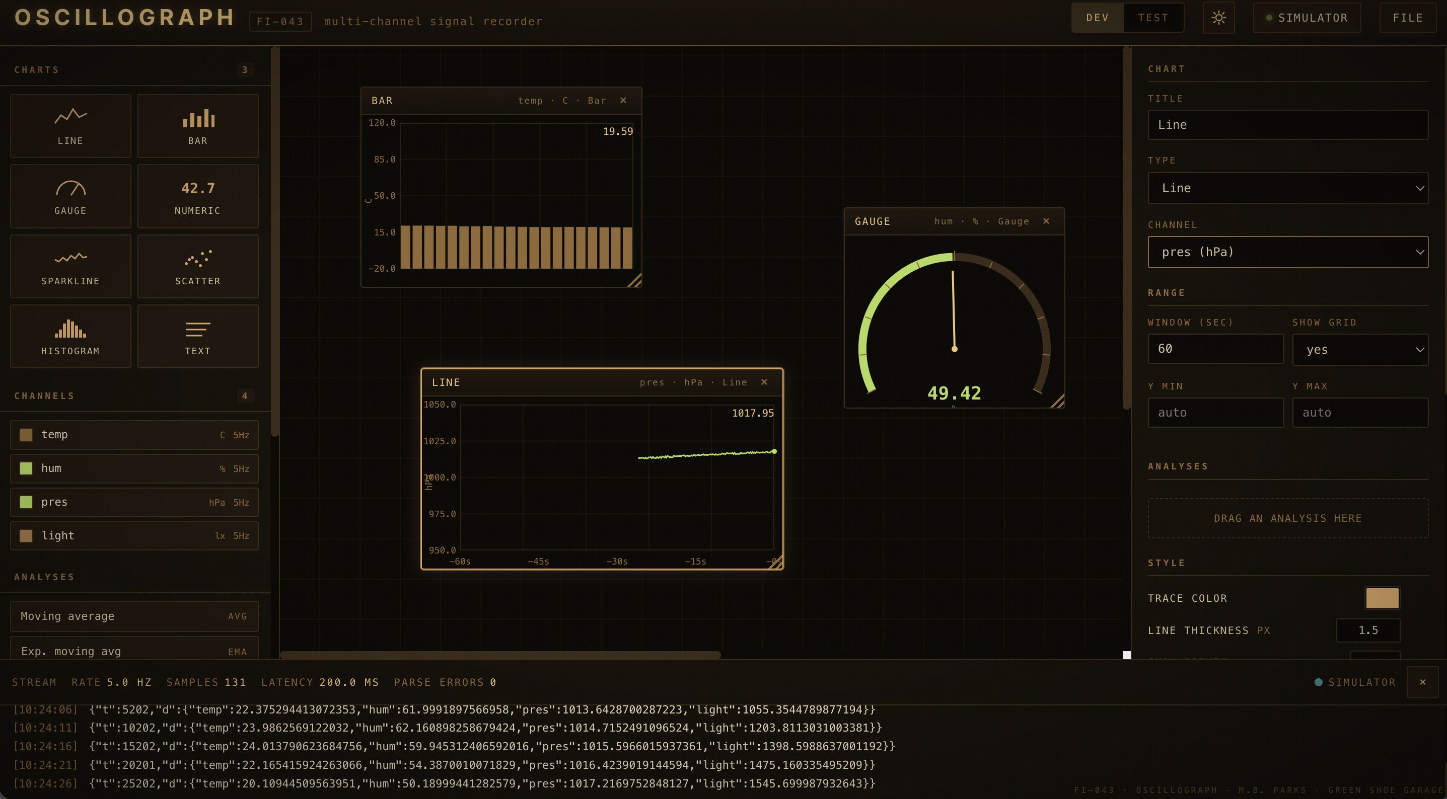
No accounts. No cloud. No install. No library to chase down through three layers of paywall. Just a single HTML file talking to a single serial port.
The protocol on the device side is about as simple as it gets. You send one line of JSON every tick:
{”t”:12345,”d”:{”temp”:23.5,”hum”:45.2}}
And on the first connect, one announcement that says which channels are coming:
{”hello”:”my-device”,”channels”:[{”id”:”temp”,”unit”:”C”, ...}]}
There is a header file, Oscillograph.h, that does all of this for you in maybe ten lines of Arduino code. Declare your channels in setup. Send your values in loop. If you have used Serial.print, you can use this. The library is GPL-3.0 and the file is sitting in the FILE menu, ready to download next to your sketch.
The dashboard gives you eight chart types. Line traces, bars, dial gauges, sparklines, scatter plots, histograms, big numeric readouts, and a plain text panel. You drag what you want from the rail on the left and drop it on the canvas. Every chart has an inspector on the right where you can tune it. Trace color, line thickness, bar spacing, needle color, the size of the big number on a readout. The defaults are decent. If you do not want to think about styling, you do not have to. But if you do want to, the knobs are there.
There is a per-channel color too. If you decide your humidity sensor is going to be teal forever, you set it once on the channel itself and every chart bound to that channel picks it up. Change your mind later, change it again. It is your panel.
There is an analysis pack, which is the part I am proudest of. Moving average. Exponential smoothing. Derivative. Cumulative integral. Threshold gate with hysteresis. Running z-score. Min and max envelope. FFT magnitude for a peek at the frequency content. A linear calibration so you can convert raw ADC counts into real units inline. You drag an analysis onto a chart and it slots itself into the pipeline. The math runs in the browser, on whatever the device sent you. Most of these are also a few lines of code on the Arduino side if you eventually want to move them off the dashboard and onto the device itself. The chart shows you what the math does, and the inspector shows you the snippet to copy across.
There is a TEST mode that drops the dashboard and gives you a diagnostic panel: sample rate, latency, parse errors, every declared channel and what it is sending right now. Use it when something is wrong. Use it to convince yourself something is right before you bother dragging charts onto the canvas.
There is a light theme too, because not everyone wants their bench to look like a submarine at midnight. The default is dark amber sepia, easy on the eyes at the workbench during the kind of hours when I usually do this work. The light theme is cream paper and sepia ink and reads like an old engineering pad if you are doing this in daylight. The choice sticks between sessions.
You can save your project as JSON, which is just a portable file containing every chart, every channel, every style override you have made. Open it later and pick up where you left off. You can also export the whole dashboard as a standalone HTML file, which is a separate single-file viewer that anyone can open without any of the rest of the tools. Email it to someone. They plug into the same kind of device and see the same view. That portability is the part that matters to me. The dashboard is just a file. Not a service. Not a subscription. Not a thing that vanishes when a company pivots away from the maker market.
This is the tool I have been wanting for years, honestly. I have a stack of half-finished sensor projects out in the garage that never quite became anything, mostly because the moment I wanted to see what they were doing, I had to choose between Serial Plotter (limited), Processing (heavyweight), a Python notebook (overkill for a five-channel telemetry stream), or pay-by-the-month telemetry-as-a-service (no thank you). What I wanted was a sheet of dashboard glass I could put in front of my hardware so I could go back to working on the hardware.
Now I have one. So does anyone else who wants one. Grab the code on GitHub.
73s
Make. Hack. Learn. Share. Repeat.